WordPress is built around two basic concepts. Posts and Pages. Posts are typically blog entries. A series of articles, listed (usually) reverse-chronologically. Pages are used for more static content (i.e. content that doesn’t change or changes infrequently). An ‘About us’ page is an example of a Page on a typical website. In most cases you’ll find that the content in the ‘About us’ page doesn’t change all that frequently. Now, you might be thinking, “but I don’t need a blog”. This might be true, but you can also use the blog concept if you have a site where you need to display your ‘latest news’ or even just company updates. Basically, any information that gets updated on a semi-regular basis can benefit from the ‘blog’ functionality. Whether that’s a traditional blog, your company’s ‘latest news’ or even just your own personal updates.
Posts #
After clicking on the Posts menu option you’ll be shown a list of Posts that your site contains. Among the information displayed is the Post title, the Author, Categories, Tags, No. of Comments and either the Date Published, Date Scheduled or the Date the Post was Last Modified. The Posts screen will look similar to the screen below.
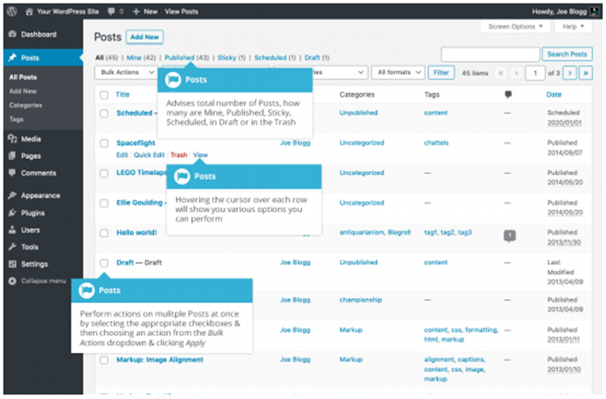
At the top of the page, you can view how many Posts in total you have in your site, how many have been published by yourself or Published, Scheduled, Sticky, Pending, in Draft or in the Trash.
When hovering your cursor over each row, a few links will appear beneath the Post title.
- Edit – Will allow you to edit your Post. This is the same as clicking on the Post title.
- Quick Edit – Allows you to edit basic Post information such as Title, Slug, Date plus a few other options
- Trash – Will send the Post to the Trash. Once the Trash is emptied, the page is deleted.
- View – Displays the Post. If the Post hasn’t been published yet, this will say Preview.
Next to each Post title is a checkbox. This allows you to perform an action on multiple items at once. You simply check the Posts that you would like to affect and then from the Bulk Actions dropdown select either the Edit option or the Move to Trash option and then click the Apply button. The Edit option will allow you to edit the Categories, Tags, Author, whether to allow Comments and Pings or not, the Status and whether the Posts are ‘Sticky’. The Move to Trash option will move the selected items to the Trash.
You can also filter the pages that are displayed using the dropdown lists and the Filter button.
Clicking the Screen Options button at the top-right of the screen allows you to change how the Posts list is displayed. Click the List View option to display the posts in the traditional List View or click the Excerpt View option to display a short excerpt from the Post underneath the Post title. You can also hide various columns from view if you don’t want to see them. Clicking the Apply button will save your changes.
Pages After clicking on the Pages menu option you’ll be shown a list of Pages that your site contains. Among the information displayed is the Page title, the Author, No. of Comments and either the Date Published or the Date the Page was Last Modified. The Pages screen will look similar to screen below.
At the top of the page you can view how many Pages in total you have in your site, how many have been published by yourself or how many are Published or in Draft.
When hovering your cursor over each row, a few links will appear beneath the Page title.
Edit – Will allow you to edit your Page. This is the same as clicking on the Page title
Quick Edit – Allows you to edit basic Page information such as Title, Slug, Date plus a few other options
Trash – Will send the Page to the Trash. Once the Trash is emptied, the page is deleted
View – Displays the Page. If the Page hasn’t been published yet, this will say Preview
Next to each Page title is a checkbox. This allows you to perform an action on multiple items at once. You simply check the Pages that you would like to affect and then from the Bulk Actions dropdown select either the Edit option or the Move to Trash option and then click the Apply button. The Edit option will allow you to edit the Author, Parent, Template, whether to allow Comments or not and the Status of each of the checked items. The Move to Trash option will move the selected items to the Trash.
You can also filter the pages that are displayed using the dropdown list and the Filter button
Adding your Site Content #
Adding content to your site is an easy process no matter whether you’re creating a Post or a Page. The procedure for both is almost identical. Apart from how they display on your site, which was described earlier, the other main difference is that Posts allow you to associate Categories and Tags whereas Pages do not. What’s the difference between categories and tags? Normally, Tags are ad-hoc keywords that identify important information in your Post (names, subjects, etc) that may or may not recur in other Posts, while Categories are pre-determined sections. If you think of your site like a book, the Categories are like the Table of Contents and the Tags are like the terms in the index.
Block Editor #
The Block Editor is a brand-new editing experience. As the name suggests, the Block Editor treats all your content as individual blocks. Each block can be inserted, rearranged and styled individually, making this new editor more flexible than the old (TinyMCE) Classic Editor.
The Block Editor provides individual blocks for all your common content such as paragraphs, headings, ordered and unordered Lists (i.e. bullet points), quote, images, galleries and any other content that you could previously add to the Classic Editor. On top of that, the Block Editor also provides additional blocks for easily adding content such as buttons, tables and columns.
Rearranging your content is even easier than before. The Block Editor allows you to drag-and-drop or use the block mover icons, to rearrange the order of individual blocks. Each block can also be styled individually using the toolbar at the top of block. The types of styles that you can add to a block are dependent on the individual block. A Paragraph Block for example, allows you to change the text size, text colour and background colour, whereas a Heading Block will only allow you to change the level (H2, H3 etc.) and the text alignment.
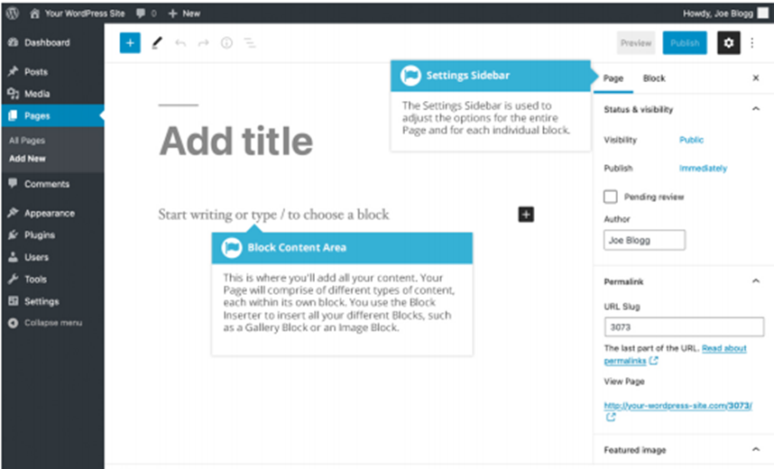
Adding a New Page #
To add a new Page, hover your cursor over the Pages menu option in the left-hand navigation menu and in the fly-out menu, click the Add New link. Alternatively, click the Pages menu option and then click the Add New link underneath, or the Add New button at the top of the page. You will be presented with a page similar to the image below.
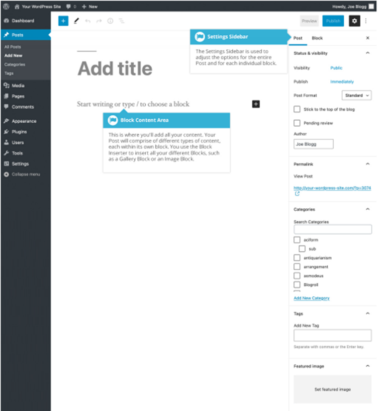
Adding a New Post
To add a new Post, hover over the Posts menu option in the left-hand navigation menu and in the fly-out menu, click the Add New link. Alternatively, click the Posts menu option and then click the Add New link underneath, or the Add New button at the top of the page. You will be presented with a page similar to the image below.
Block Editor Tools #
The new Block Editor provides a completely redesigned editing experience, and along with it, a new set of tools with which to edit your page. Although the editing interface is completely new, you will find many elements that you’re already familiar with.
At the top of the page is the main Block Editor Toolbar. This new toolbar contains a number of new icons and some old familiar ones:
The Add Block icon is used to insert new blocks into your content. Clicking this icon will open the block inserter panel that gives you access to all the different types of blocks that you can insert.
The Tools button offers different interactions for block selection & editing. Use the Select tool to help select Blocks. Once a Block is selected, press your Enter key to use the Edit tool.
The Undo icon allows you to Undo your most recent change(s).
The Redo button allows you to Redo your most recent change(s)
The Switch to Draft button only appears after your Page/Post is published. Clicking this button will unpublish your Page/Post and put it back in Draft mode.
The Save Draft button allows you to save your Page and will only appear if your Page/Post has not been published yet.
The Preview button will allow you to preview your page. The preview page will open a new browser tab/ window
The Publish button allows you to publish your Page/ Post. Unlike previous versions a WordPress, publishing your page is now a two-step process. After clicking the Publish button the first time you’re then shown a new panel with a confirmation message and another Publish button. This panel also allows you to change the visibility of your content and the publish date and time. Clicking this second Publish button will actually publish your content and make it live on your site.
If your content is published, then the Publish button will be replaced with an Update button. Just like in previous versions of WordPress, clicking the Update button saves your changes.
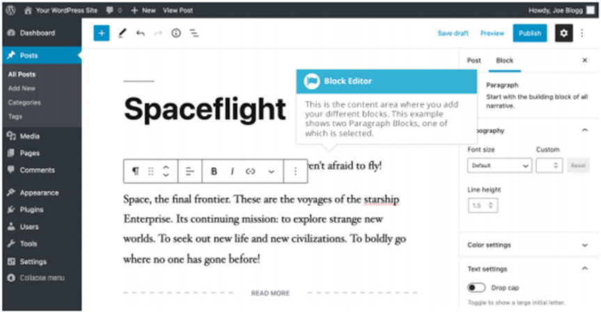
Underneath the Block Editor Toolbar you’ll find your content area. This is where you’ll add all your content, comprised of various types of blocks. Each block that you add into your content area, will have its own toolbar, and will either display just above the block (by default) or in the main Block Editor Toolbar at the top of the screen (if the Top Toolbar option is turned on).
Each block will have a different toolbar, and the icons in that toolbar will be dependent on the type of content that the block contains. As an example, the toolbar on a Paragraph Block will be different to the toolbar on a Heading Block, because they contain different types of content. After clicking on, or selecting a block, you may even find there are extra options that you can set in the Settings Sidebar. Again this will depend on the individual block that you’ve selected.
Next to your content area on the right hand side of the screen, is the Settings Sidebar. The Settings Sidebar contains settings for the whole Page/Post that you’re currently editing, as well as settings for the currently selected block.
At the top of the Settings Sidebar there are two tabs that you can select. The first tab will either say Page or Post, depending on whether you’re editing a Page or Post, and the second tab will say Block. The Page/Post tab shows the settings for the individual Page/Post that you’re currently editing. This may include things like setting your featured image, selecting Categories and Tags (when editing a Post), or selecting a Page/Post template, among other things.
The Block tab shows the settings for the currently selected block. These settings will change depending on the type of block that is currently selected, and some blocks have more settings than others. As an example, the Paragraph Block has settings for changing the size of the text, whether to display a Drop Cap, and in some themes, settings for the text colour and the background colour. The Heading Block on the other hand, only has settings to change the text size, Line height, and colour.
Block Editor Options #
There are several options available to help customise how the Block Editor displays. These options can be found under the Options icon in the top-right corner of the page ( ) when editing a Page or Post
The Options menu provides the following useful options:
Top Toolbar – Enabling this option will display the Block Toolbar at the top of the page, rather than just above each individual block.
Spotlight Mode – Enabling this option will dim all the blocks on the page except for the currently selected block, making it easier to focus on just that block.
Fullscreen Mode – Enabling this option will hide the top admin bar and the left-hand menu. This is similar to the Distraction-free writing mode that was available in the old Classic Editor.
Visual Editor – This option is enabled by default and will show your content as individual blocks. Code Editor – Enabling this option will turn off the Visual Editor and instead, display the html that makes up your content.
Copy All Content – This option will copy all the content within the current Page or Post, to your clipboard
Adding Content with Blocks Using the new Block Editor, your page content is made up of blocks of various types. Each individual bit of content in your page will be a different block. Even individual paragraphs will be separate blocks. The Block Editor provides blocks for all your common content such as paragraphs, headings, ordered and unordered Lists (i.e. bullet points), quotes, images, galleries and any other content that you could previously add using the old Classic Editor.
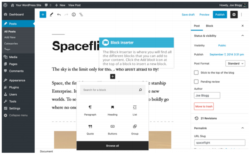
There are several ways to insert blocks into your content. The easiest way is to click the Add block icon ( ) in the Block Toolbar at the top of screen. Clicking this icon will show the Block Inserter panel that gives you access to all the different types of blocks that you can insert. Simply scroll through the list and click on the type of block that you’d like to insert, or if you know the name of the block, you can start typing its name in the search field to filter the list of blocks shown.
When using the Block Inserter at the top of the screen, a small preview panel is shown on the right-hand side of the Inserter. As your cursor hovers over each block type, a small preview of that block will be displayed. The list of blocks in the popup panel are sorted into different sections based on their type. Once you click on a block to insert it, if there are no blocks on the page that are selected then the new block will be appended to the bottom of your content, below all the existing blocks in the page. If you have a block selected in your page when you insert a new block, the new block will be inserted below your currently selected block. You can also drag ’n drop a Block from the Block Inserter, into your page, at any location. When dragging the block you wish to insert, you should see a blue horizontal line appear between the blocks in your page, which indicates where you can drop your block.
You can also insert blocks by clicking the Add block icon ( ) that appears at the top of each individual block. This Add Block icon appears at the top of each block when you move your cursor over the top border of each block. Clicking this icon will show a Block Inserter popup, which is a small panel that gives you access to all the different types of blocks that you can insert. By default, it only shows six recent blocks. To view all the available blocks, click the Browse all button in the popup to show the Block Inserter panel. Alternatively, if you know the name of the block, you can start typing its name in the search field to filter the list of blocks shown. Once you click on a block to insert it, the new block will be inserted above the currently selected block.
If you see an empty Paragraph Block at the very bottom of your content and you simply want to add a new paragraph of text, then all you need to do is put your cursor in the empty block and start typing. If you want any other type of block though, you need to click the Add block icon
Fullscreen Mode WordPress now opens the Block Editor in Fullscreen mode by default, when you add a new Page or Post. Fullscreen mode will hide certain parts of the User Interface such as the left-hand menu. To turn off Fullscreen mode, click the Options icon ( ) in the top-right corner of the page and then click on the Fullscreen mode option. This will return the page back to the familiar layout that you’re accustomed to.
In Fullscreen mode, clicking the WordPress logo in the top-left corner of the page will take you out of the Block Editor and return you to your list of Posts or Pages. Unfortunately, when you turn off Fullscreen mode at the moment, your choice is stored in your browser’s local storage. This means that if you clear your browsers cache, start editing your site in a different browser, or on another computer, Fullscreen mode will automatically turn back on and you’ll need to manually turn it off again.
Text Blocks #
The Text section contains all the basic text type blocks such as the Paragraph Block, Heading Block, list Block, Classic Block, Quote Block etc.
Classic Block
The Classic Block allows you to add text content to your site using the traditional TinyMCE interface. One of the benefits of using the Classic Block instead of the Paragraph Block is that you can enter multiple paragraphs of text into the same block. The Classic Block also provides the useful ‘Paste as text’ icon, unlike the Paragraph Block. This allows you to strip all formatting from any formatted text, such as content copied from a Word document or another website. Like the previous TinyMCE interface in the Classic Editor, the Classic Block also provides the ‘Special character’ icon for inserting characters like the copyright (©), registered (®) or trademark (™) symbols, en (–) and em (—) dashes, and other useful characters.
Heading Block
The Heading Block allows you to insert an HTML Heading into your page. By default, the heading will be a H2 but you can change this using the icons on the Heading Block toolbar.
Once you’ve added your text to your block, there are further options available in the Settings Sidebar. You change the Font size, Line height, text colour, background colour, and you can also add an HTML Anchor to the heading which enables you to create a link to a specific part of your page.
List Block
The List Block allows you to add ordered and unordered lists (i.e. bullet points) to your content. After adding your list items, you can select the appropriate icon on the Block Toolbar to change between an ordered list and an unordered list.
If you’ve inserted an Ordered List (sometimes also referred to as a numbered list), you can also specify the start value for the list and also opt to display the numbers in reverse order using the Reverse list numbering toggle switch, in the Settings Sidebar.
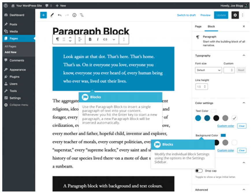
Paragraph Block
The Paragraph Block allows you to enter a paragraph of text. Each paragraph is a new block so when you hit the Enter key to start a new paragraph, a new Paragraph Block will be automatically inserted as you continue to type.
Once you have added your content to your Paragraph Block, there are further options available in the Settings Sidebar. You can change the size of the text using the Font size dropdown or the Custom number field next to it. The Dropdown field has some preselected sizes such as Small, Normal, Medium, Large and Huge. The exact size of these, and the names, will be dependent on the theme that you’re currently using. If you want to select an exact pixel size, you can use the number field next to the dropdown to enter an exact number. Click the Reset button to reset the font size back to its default size.
The Drop Cap switch allows you to turn the first character in the paragraph to a Drop Cap. A Drop Cap is where the first letter of a paragraph is enlarged to “drop” down two or more lines. Drop Caps are typically used to grab a readers attention. The Drop Cap will only display when the block is selected. When you’re adding content to your paragraph block, or editing existing content, the first character will display the same size as the rest of the paragraph text.
The background and text colours can also be changed using the Colour settings in the Settings Sidebar. By default, there are a number of pre-selected colours to choose from as well as a custom colour picker, for selecting any colour. Depending on your theme, the available colours may be different to the default colours, so as to match the styles within that theme.
If the colour combination that you select for the background and text are hard to read, you’ll be prompted with a warning advising you that “This colour combination may be hard for people to read. Try using a brighter background colour and/or a darker text colour”. In this instance, it’s advisable to use either a brighter background and darker text colour, or a darker background and a brighter text colour.
Pullquote Block
The Pullquote Block allows you to highlight certain text. Pull quotes are short excerpts from your content. They’re used to pull a text passage out of the content so as to highlight and provide a visual aid to your readers. Once you’ve added your content to your block, you can select from one of two different styles using the Styles panel in the Settings Sidebar or by clicking on the Change block type icon on the Block Toolbar. If you select a style in the Default Style dropdown list, any further Quote Blocks you add into your page will use that selected style by default. You can also change the main colour and text colour.
Quote Block
The Quote Block allows you to add a quote along with a citation. Once you’ve added your content to your block, you can select from one of two different styles using the Styles panel in the Settings Sidebar or by clicking on the Change block type icon on the Block Toolbar. If you select a style in the Default Style dropdown list, any further Quote Blocks you add into your page will use that selected style by default.
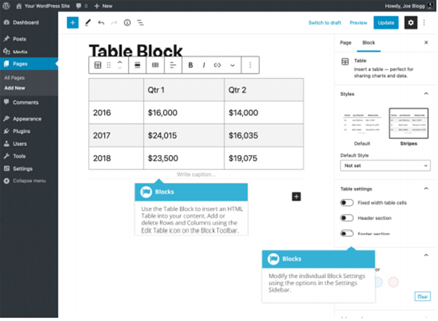
Table Block
The Table Block allows you to add an HTML table to your content. A Table is a structured set of data made up of rows and columns. Once you’ve added your content to your block, there are further options available in the Settings Sidebar. When you first add a Table Block, you’re prompted for the number of columns and rows that you want. If you wish to add or remove columns or rows, use the various options available under the Edit Table toolbar icon.
Media Blocks #
The Media section contains all your image and media type blocks such as the Image Block, Gallery Block, Audio Block, Cover Block etc.
Audio Block #
The Audio Block allows you to embed a simple audio player into your content. After inserting the Audio block, click the Upload button to upload a new audio file to your media library or click the Media Library button to show your media library and select an existing file that you’ve uploaded previously. Clicking the Insert from URL button allows you to select a media file that exists at some other URL.
Once you’ve added your audio file to your block, there are further options available in the Settings Sidebar. You can select Autoplay to have the file automatically play, and you can select Loop to have the audio continuously loop over and over again.
File Block #
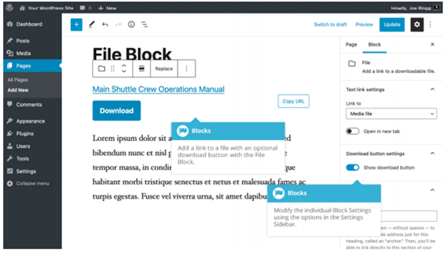
The File Block allows you to create a text link, with an optional button, to one of your uploaded media files such as a PDF or Word Doc. After inserting the File Block, click the Upload button to upload a new file to your media library or click the Media Library button to show your media library and select an existing file that you’ve uploaded previously. Once you’ve added your file to your block, there are further options available in the Settings Sidebar. You can choose to link to the media file itself, or link to the WordPress attachment page for that file. You can also elect to open the link in a new tab along with electing to display a Download button with the text link. You can change the text on the button by clicking on the button and typing in your new text.
Gallery Block #
The Gallery Block allows you to add an image gallery. After inserting the Gallery Block, click the Upload button to upload images to your media library or click the Media Library button to show your media library and select existing files that you’ve uploaded previously. Alternatively, simply drag ’n drop your new images onto the Gallery Block and they will be automatically uploaded to the Media Library and inserted into the Block.
Once you’ve added your images to your block, there are further options available in the Settings Sidebar. You can choose the number of columns that your image gallery should display. You can also elect to have your thumbnails cropped so that they align more evenly.
Using the Link To dropdown field, you can choose to link each gallery image to the media file itself, or link to the WordPress attachment page for that file. Alternatively, you can also choose not to have any links on your gallery images. You can add a caption to each image when you upload them to your Media Library, or by simply clicking on each image once it’s in the Gallery Block, and entering the caption into the field provided.
You can also add a caption for the whole gallery by entering some text into the ‘Write gallery caption…’ field at the very bottom of the Gallery Block. How your captions display will be dependant on the theme you’re currently using.
Image Block #
The Image Block allows you to add an image to your content. After inserting the Image Block, click the Upload button to upload an image to your media library or click the Media Library button to show your media library and select an existing file that you’ve uploaded previously. Alternatively, click the Insert from URL button to enter the URL of the image you would like to display. You can also drag ’n drop your image onto the Image Block and it will be automatically uploaded to the Media Library and inserted into the Block.
You can add a link to the image using the Insert Link icon ( ) on the Block toolbar. You can link the image to the media file itself, link to the WordPress attachment page for that file, or enter in a custom URL for the link using the provided edit field.
Once you’ve added your image to your block, there are further options available in the Settings Sidebar.
Alternative Text can be added to your image using the Alt Text field. You can also select a style for your image. Your image will display with square corners by default, but you can also show your image with a rounded mask by selecting the Rounded style. If you select a style in the Default Style dropdown list, any further Image Blocks you add into your page will use that selected style by default.
If you want to change the size of your image, there are a number of ways to do it. You can use the Width and Height fields to set the exact pixel width of your image, or you can use the percentage buttons (e.g. 25%, 50%, 75%, 100%) to change the width accordingly. Alternatively, you can also select the size from the Image size dropdown field. The default WordPress image sizes are available to select (e.g. Thumbnail, Medium, Large or Full Size), and depending on your theme, you may also have other sizes available to you as well.
You can also change the size of the image using the drag handles on the image itself, within the block. Simply position your cursor over one of the blue dots that appears on the edge of the image and then click and drag the image to the size that you want.
When resizing your images, it’s always best to only reduce the size, and not enlarge. If you add a small image to your block, and then increase the size, the image will become pixelated and wont appear crisp when viewing your page.
To display a text caption below your image, click in the Write caption… section just below the image and type in your caption.
Basic image editing is also available by clicking the Crop icon ( ) on the Block Toolbar. After clicking Crop, you’re provided with three extra icons that allow you to zoom into your image, change the aspect ratio and rotate the image. After making any of these changes, click the Apply button to apply your changes or the Cancel button to cancel the changes.
Video Block #
The Video Block allows you to add a video to your content. You can select a video that you’ve previously uploaded to your Media Library, or you can upload a new video. You can also just specify the URL for a video if you know it. Like the Gallery and Image Blocks, you can also drag ’n drop your video onto the Video Block and it will be automatically uploaded to the Media Library and inserted into the Block. To display a text caption below your video, click in the Write caption… section just below the video and type in your caption.
Once you’ve added your content to your block, there are further options available in the Settings Sidebar. You can set the video to Autoplay and Loop, as well as mute the sound. You can also hide the video controls (i.e. Play/Pause, Fullscreen buttons etc.) and specify a poster image for the video. This latter option is really useful if your video doesn’t include its own thumbnail image
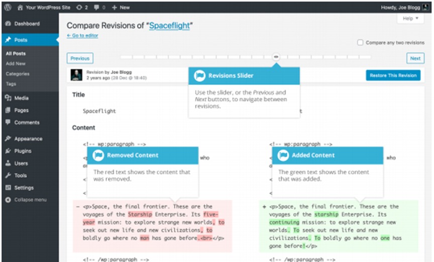
Reviewing Past Revisions #
When you’re editing your Post or Page, the number of revisions for that particular Post or Page is shown on the Document tab in the Settings Sidebar, if you have any. Click the Revisions link just under the Status & Visibility Panel to browse through the various revisions for the current Post or Page.
Use the slider at the top of the page or click the Previous and Next buttons to navigate through your various Post or Page revisions.
Content that has been deleted will be shaded red and content that has been added will be shaded green. If there is content that is shaded dark red and/or dark green, it’s highlighting specific content that was removed or added. If the paragraph or line is simply light red and/or light green, then the whole paragraph or line was affected by the change.
You can also compare two different revisions by clicking the Compare any two revisions checkbox at the top of the page. If you’d like to restore a previous revision, click the Restore This Revision button.
Editing Existing Content #
To edit an existing page, simply click on the relevant Page/Post title, when viewing your list of Pages or Posts. Alternatively, click on the Edit link that appears beneath the title when hovering your cursor over each row.
The screen that appears will be exactly the same as the Add New Page/Add New Post screen, only with the existing content displayed. When you’ve finished editing your Page/Post, click the Update button.
Deleting Content #
If you wish to delete one of your Pages or Posts, click on the Trash link that appears beneath the title when hovering your cursor over each row. This will move the Page/Post to the Trash
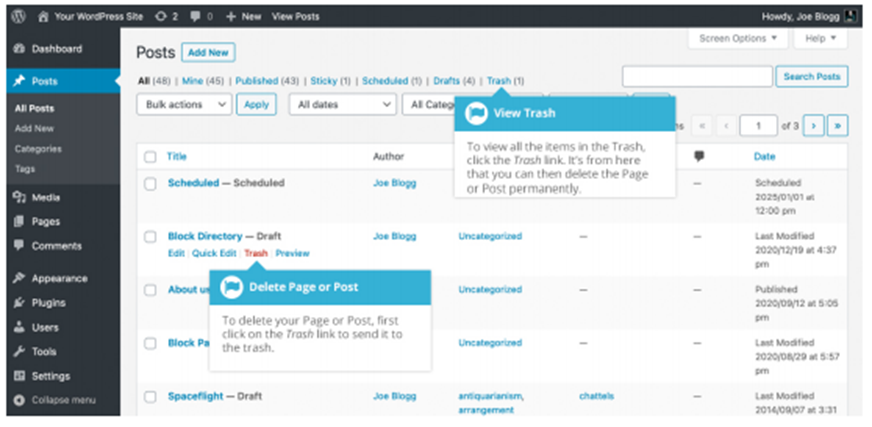
To delete the Page/Post permanently or to restore the Page/Post, click the Trash link at the top of the screen. When the cursor is hovering over each item in the Trash, the Restore and Delete Permanently links appear. Click Delete Permanently to permanently remove a single Page or Post. Clicking Restore will restore the Page or Post.
If you would like to permanently delete or restore numerous items at once, click the checkboxes next to the items you would like to delete or restore and then choose either Restore or Delete Permanently from the Bulk Actions dropdown list at the top of the page. After selecting the appropriate action click the Apply button to make your change. Alternatively, click the Empty Trash button to delete all the items in the Trash.
Saving and Publishing content #
Once you’ve added all your content to your Page or Post you have the option of Saving the Page as a Draft or Publishing the page. Clicking the Save Draft link will simply save your Page/Post. This is handy if you would like to come back at a later date to add more content or if you’re simply not ready to publish yet.
If you’d like to see what you Page/Post will look like before you Publish, click the Preview button. This will open a preview of the current Page/Post in another browser tab. There are several options available when saving. By default the Status is set to Draft when you simply click Save Draft. Ticking the Pending Review checkbox within the Status & Visibility panel in the Settings Sidebar sets the page Status to Pending Review. This means the draft is waiting for review by an editor prior to publication.
You can also change the visibility of the Page by clicking the link just to the right of Visibility within the Status & Visibility panel.
Public is the default and means the page is viewable to all.
Private hides the content from the public completely. Normal users and visitors will not be aware of private content. You will only see the private content when you are logged into your WordPress blog.
Password Protected allows you to assign a password to your page. Only people who have the password will be able to access the page.
Within the Permalink panel in the Settings Sidebar is the full URL for your Page or Post. You’ll see this URL after saving your content for the first time, along with the Page/Post Slug that was generated for the page. Clicking this URL link will take you to the published page, or if the page hasn’t been published yet, a preview of the page. You can edit this page slug by editing the URL Slug field just above the URL link. You might decide to do this for improving SEO (Search Engine Optimisation). Most times though, you’ll simply leave the default URL which WordPress automatically generates based on your Page/Post Title.
By default, when you publish a Page/Post your content is published immediately. To change this, click the link just to the right of Publish within the Status & Visibility panel. You can then select the date and time that you’d like to schedule your Page/Post to be published. After setting a date & time to publish, you must still click the Publish button to publish at the desired date and time.
Within the Block Editor, publishing your content is a two-step process. After clicking the Publish button, you’re shown a new publish panel, confirming your selection, along with giving you another chance to update your contents visibility & publish date. Clicking the Publish button here will publish your Page/Post and make it live on your website.
Categories #
You can use categories to define sections of your site and group related posts. The default category is Uncategorized but this can be easily changed in your Settings. Pages cannot be associated with Categories. You can only associate Categories to Posts.
There are two ways to add Categories. They can be added whilst adding or editing your Post or they can be added via the Categories menu option. Adding Categories whilst editing your Post, will automatically assign those Categories to your Post. Adding Categories using the Categories menu option will simply add them to the list of available Categories.
When you click on the Categories menu option you’ll be shown a list of Categories that have already been added along with some blank fields that allow you to add a new Category.
Categories determine where on the website your posts will be displayed. e.g. a post that is added to the News Releases category will be displayed on the news page and the most recent displayed on the Home Page while one added to Articles or Documents will show on the Publications or Documents sections.
Adding Categories within your Post #
Adding Categories whilst editing your Post will automatically assign those Categories to your Post.
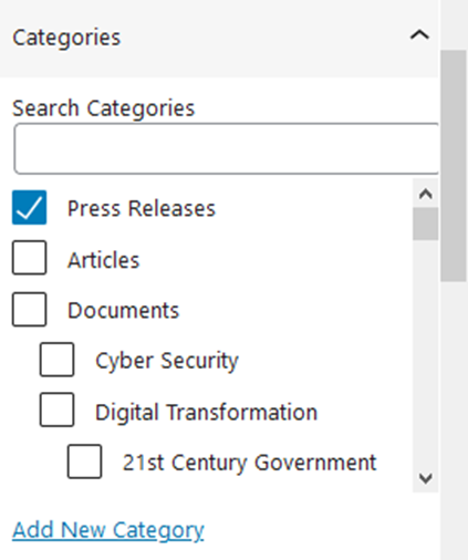
When using the Block Editor, click on the Document tab in the Settings Sidebar. The Categories panel can be found just below the Permalink panel. To add an existing Category, simply tick the checkbox(es) next to the Categories you’d like to assign to the Post.
If you would like to create a new Category and assign it to the Post at the same time, click the Add New Category link. Two fields will then appear. Type the name of the Category that you’d like to add into the empty input field. If you’d like the new Category to have a Parent, select it from the Parent Category dropdown list. Click the Add New Category button when done to create the Category and automatically assign it to the Post.
Tags #
Tags are ad-hoc keywords that identify important information in your post (names, subjects, etc) that may or may not recur in other posts. Unlike Categories, Tags have no hierarchy, meaning there’s no relationship from one Tag to another. Pages cannot be assigned Tags and cannot be associated with Categories. You can only associate Tags and Categories to Posts.
Like Categories, there are two ways to add Post Tags. They can be added whilst adding or editing your Post or they can be added via the Tags menu option. Adding Tags whilst editing your Post, will automatically assign those Tags to your Post. Adding Tags using the Tags menu option will simply add them to the list of available Tags.
When you click on the Tags menu option you’ll be shown a list of Tags that have already been added, along with some blank fields that allow you to add a new Tag.
To add a new Tag, fill in the blank fields and then click the Add New Tag button:
Name – The name is how it appears on your site.
Slug – The Slug is the URL-friendly version of the name. It’s usually all lowercase and contains only letters, numbers, and hyphens
Description – The description is not prominent by default; however, some themes may display it Once you add a new Tag it will appear in the list of Tags on the right side of the screen. When hovering your cursor over each row in the list of Tags, a few links will appear beneath the Tag name
Edit –Allows you to edit the Tag properties such as Name, Slug and Description
Quick Edit – Allows you to quickly edit the Tag Name and Slug
Delete – Deletes the Tag permanently from the list of Tags. After clicking Delete you will be prompted to confirm your choice. Click OK to delete the Tag or Cancel if you don’t want to delete it
View – This will list all the Posts that are currently using this Tag
If you would like to permanently delete numerous Tags at once, click the checkboxes next to the Tags you would like to delete and then choose Delete from the Bulk Actions dropdown list at the top of the page. After selecting Delete, click the Apply button to immediately delete the selected Tags (you will not be prompted to confirm your choice)
Adding Tags within your Post #
Adding Tags whilst editing your Post, will automatically assign those Tags to your Post. When using the Block Editor, click on the Document tab in the Settings Sidebar. The Tags panel can be found just below the Categories panel. To add a new Tag, simply write the Tag or Tags (separated with commas) into the edit field. If you make a mistake and need to remove a Tag, simply click the small ‘x’ next to the individual tag to remove it. When you start typing your tags, a list of previously used tags will display below the edit field if any of the characters that you type, match a previously entered.
Tag. If a list of previous Tags appears, you can click on any of the Tags to select them